
Enhancing Aware's Logistic management system experience.
background
My role
Lead UX/UI Designer
Team
Andressa Aquino, CPO
Lucas Tarsitani, PM
Pedro Paixão, PM
Lucas Tarsitani, PM
Pedro Paixão, PM
Project
This project describes the strategies used to elevate the shipper experience on a logistics transportation management system (TMS), resulting in a more refined product.
Overview
Aware Logistics is a Brazilian B2B tech startup revolutionizing the logistics industry. The Aware System is a cloud-based platform that automates tasks like route planning and shipment tracking, boosting efficiency and reducing costs.
Objective
As a solo UX Designer, I delivered a navigable, high-fidelity prototype for a TMS, optimizing user experience and increasing platform engagement. It was later showcased to stakeholders, investors, and potential clients.
highlights
Tracking page visualization
Image
UI components
Image
Dashboard customization workflow
Video loop
context
Understanding the Aware System
A Logistic Management and Automation System.
Aware System has been revolutionizing the logistics industry since 2018. Their mission was to create a comprehensive platform that centralizes data, optimizes routes, improves delivery visibility, and connects the entire supply chain.
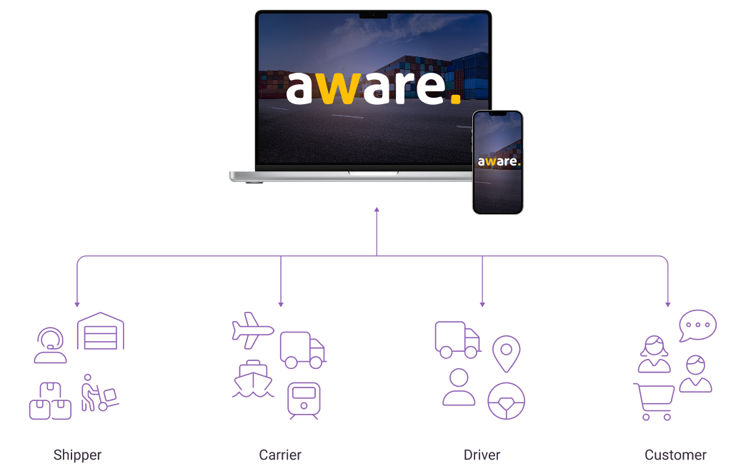
Integrated web platform and mobile app.
Aware System provides a seamless experience with both a web platform for shippers and carriers, and a mobile app for drivers. While the web platform is designed for management and planning, the mobile app keeps drivers connected in real-time, ensuring efficient operations.
Users and clients
Understanding our users and clients
Low user engagement.
Initially, we had 3 major shippers as clients, expecting 100% adoption of the Aware System within their logistics teams. However, our research revealed that only 25% of the users would fully adopt the product, raising concerns about the value of our product.

NPS survey and user interview feedback collection
Image
Inverviewing stakeholders.
To better understand why this was happening, we interviewed 11 stakeholders from those 3 differents shippers and drew some conclusions:
User vs. Buyer: The end-user and the decision-maker are often different.
Competition: Non-adopters relied on basic tools like spreadsheet and emails.
Diverse user base: We have at least 3 user types with distinct goals.
Who are using our platform?
I defined three user archetypes, mapped their Jobs to Be Done, and pinpointed the main points with the old version of the Aware System.
Logistics Planner
JOBS TO BE DONE
- Plan and optimize travel routes;
- Monitor trips in real-time;
- Generate detailed performance reports;
- Resolve issues during trips;
- Handle freight quotations and negotiations;
- Manage travel documents and permits.
pain-points with aware system
- Few cards visible on Kanban board;
- Too much useless information on cards;
- Inefficient navigation between trips;
- Lack of delivery location visibility;
- Unclear date forecasts;
- No document storage.
Finance Manager
JOBS TO BE DONE
- Track and manage transportation costs;
- Ensure timely and accurate payments to carriers;
- Generate detailed financial reports;
- Monitor budget adherence;
- Handle invoincing and dispute resolution;
- Optimize financial efficiency of logistics operations.
pain-points with aware system
- Difficulty navigation and visibility;
- Lack of centralized document storage;
- Inaccessible cost forecasts;
- Time-consuming financial report generation;
- Manual and error-prone cost tracking.
Logistics Manager
JOBS TO BE DONE
- Manages all logistics planners in their team;
- Customize Aware's workspace;
- Ensure timely deliveries;
- Manage team performance;
- Handle supplier relationships;
- Track KPIs;
- Resolve high-level operational issues;
- Optmize costs and processes.
pain-points with aware system
- Inefficient workspace customization;
- Non-user friendly customization tools;
- Manual setup processes;
- Lack of KPI integration;
- Manual performance tracking;
- Fragmented document management.
Bad experiences and lack of features.
Upon analyzing user differences, I found that we could address nearly all of the logistics planners' requirements, but the experience wasn't optimal. Logistics managers and financial managers, on the other hand, needed more functionalities.
problems
What're our biggest problems?
Uncovering the Pain Points.
Based on the analysis of the user research data I've draw an Ishikawa diagrams to identify root causes and outlined key areas where the plataform falls short of meeting user needs.

Scope of this Case Study.
This case study focuses on addressing immediate user pain points to enhance satisfaction. A separate case study will explore new features to expand the plataform capabilities and meet future user needs. This project will focus on the web platform shipper's experience.
process
Idealizing and testing our solutions
Validating our hypothesis for a better experience.
Using mid-fidelity prototype, I conducted a usability test with 11 (eleven) users. My goal was to discover the best way to upgrade our experience and to validate the implementation of the newly envisioned design.
Inefficient Kanban board design.
Based on user feedbak, I redesigned cards to be more concise and visually appealing. By prioritizing essential information and iterating on prototypes, I improved card readability and incresed the capacity of our Kanban board, providing a clearer view of the logistics process.

Previous kanban visualization
Image
EYE
Limited visibility of trips in kanban board due to oversized cards.
hourglass-clock
Overloaded cards make it hard to quickly identify trips.
shuffle
The card's order doesn't prioritize critical issues, oftenshowing trouble-free deliveries at the top while problematic ones are buried further down, requiring users to scroll to find issues.
Improving card recognition through information architecture

Previous kanban card design
Image
Provides a comprehensive view of the delivery details.
The amount of details can make the card visually cluttered and hinder quick identification of problems.
More information makes cards bigger, fitting fewer on the board.
Display pick-up date and address, irrelevant after collection.
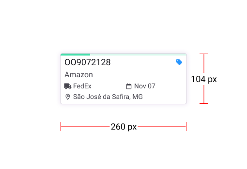
New kanban card design
Image
Quickly visualizes the delivery status with the completion bar and color indicator.
Icons provide a better readability.
Smaller cards mean more cards fit on the board.
Less detailed delivery information upfront.
Sorting and filtering Kanban cards
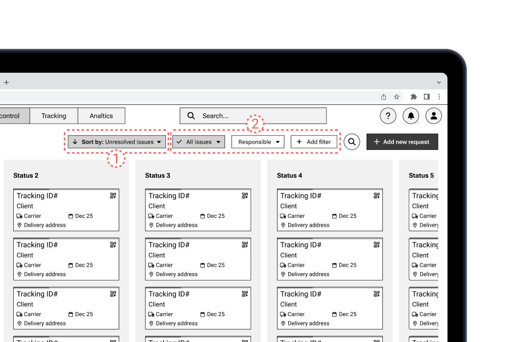
circle-1 Custom Sorting and circle-2 Custom Filter Wireframe
Image
user
Each user can configure the view according to their preferences and needs.
arrow-up-big-small
Allow trips to be organized by criteria such as importance, due date, number of issues, etc.
Kanban redesigned
New kanban visualization wireframe
Image
More cards and columns on the screen at once.
The cards have a cleaner design, making them easier to read and identify.
Filter give users more power.
Filters and sorting options allow for quicker and more efficient searches.
Inefficient navigation and workflow.
I mapped out key user journeys within the platform and streamlined them to minize page reloads and the need for multiple tabs to track concurrent tasks.
Previous navigation between deliveries details flow
video loop
face-confused
Constant switching between Kanban and detail views disrupts workflow.
arrow-down-big-small
Frequent navigation increases the chance of overlooking crucial information.
Inefficient navigation and workflow.
While designing a solution to improve the navigation flow between deliveries, I explored two potential solutions: displaying details in a popup with a background overlay for better visibility, or splitting the Kanban view to show details side-by-side. Testing revelead that the spli-screen solution was more efficient.
Option 1: Overlay pop-up
video loop
Can be quickly dismissed to return to the overview.
Provides more space for detailed information.
Temporarily obscures the Kanban board.
Could be distracting if multiple pop-ups are open.
Might require more user interaction to close.
Option 2: Split-screen
video loop
Provides a separation between the overview and detail views.
Less disruptive to the user's workflow.
Allows for simultaneous comparison of multiple deliveries.
Can reduce the overall screen real estate available for the Kanban board.
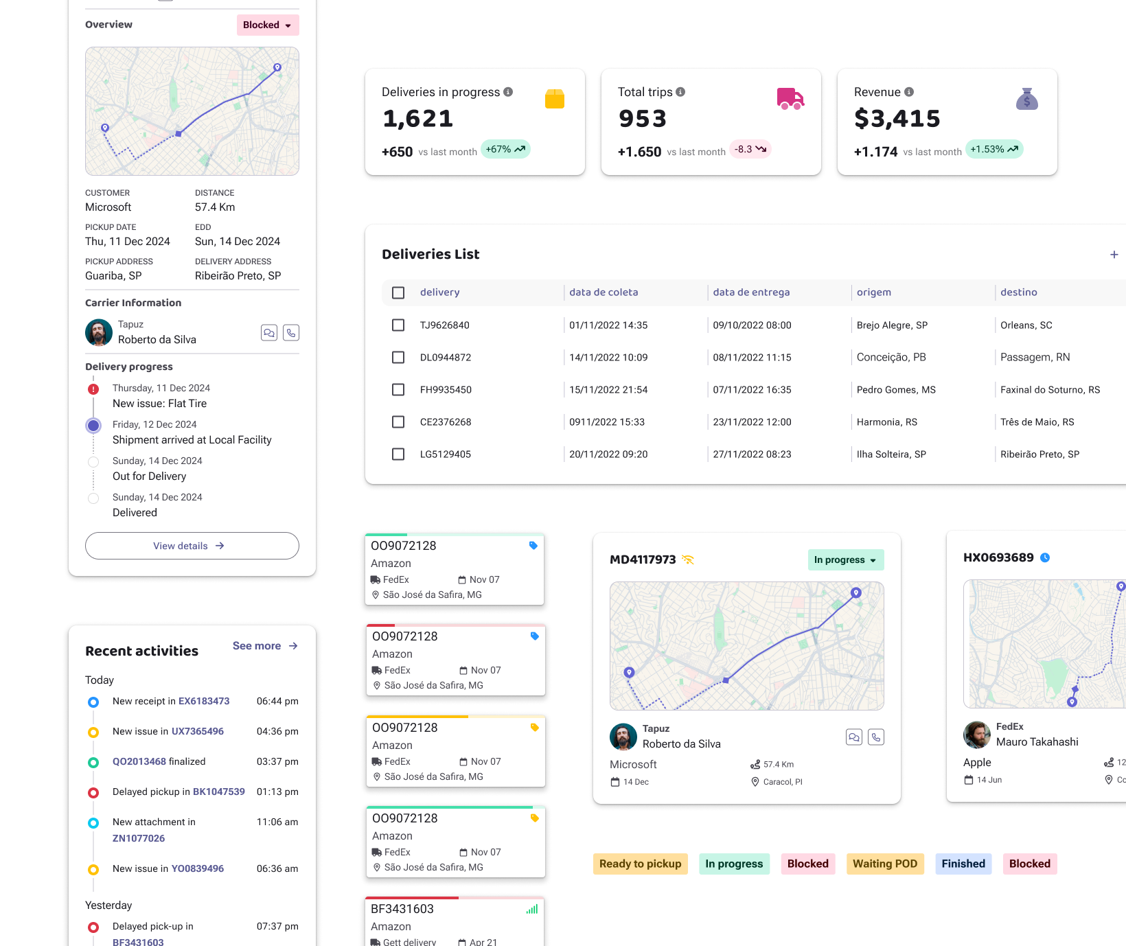
New dashboard visualization.
To empower users with deeper insights, I replaced the Kanban home screen with a new dashboard. This provides a comprehensive overview of their operations from the start.
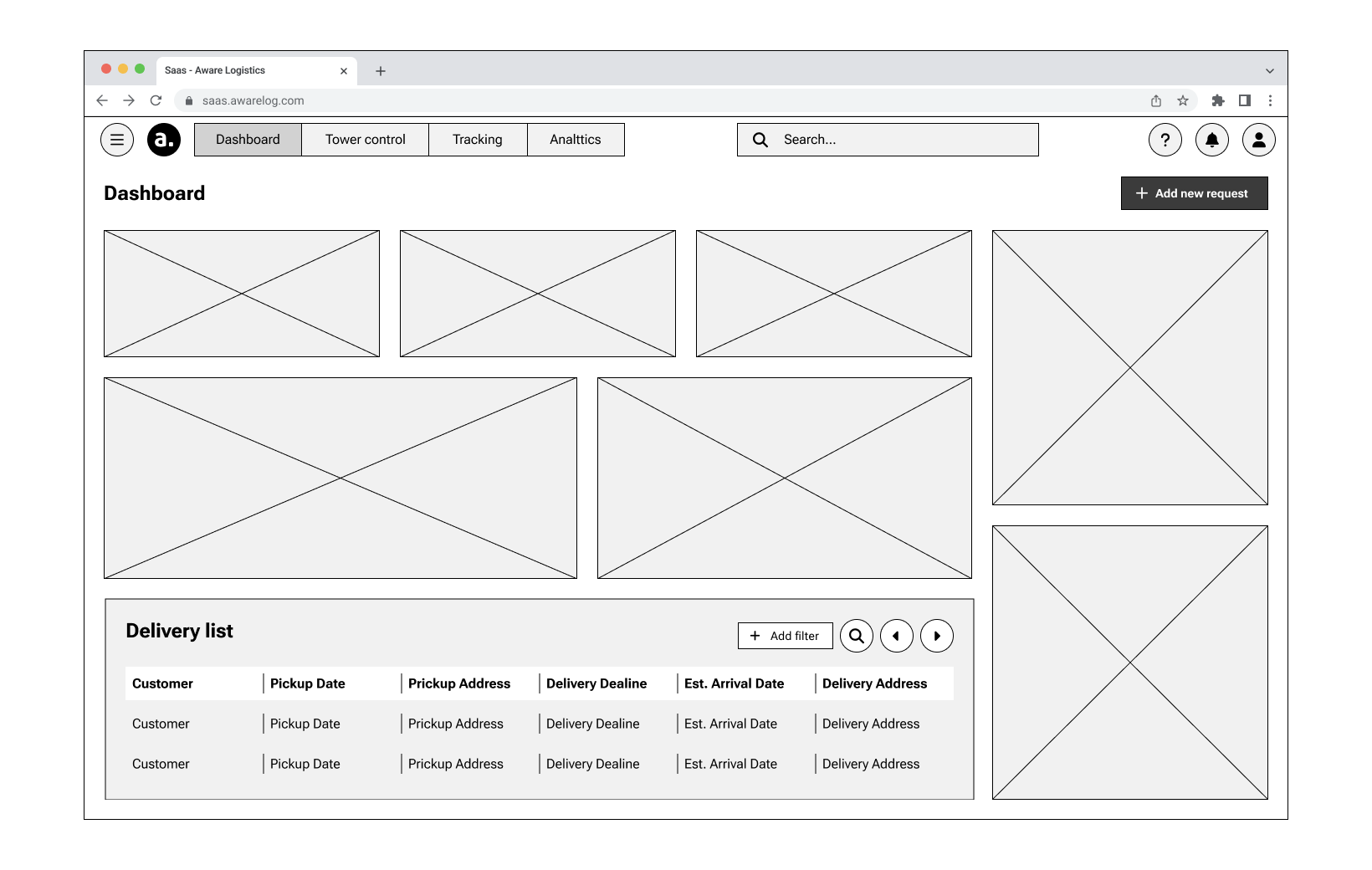
New dashboard wireframe
Image
grid-2
Dashboard provides a faster overview of delivery status.
chart-line-up-down
Visualized data facilitates trend analysis and problem identification.
user-chart
Intuitive interface boosts user satisfaction and productivity.
pen-to-square
Cutomizable dashboards ensure access to relevant information.
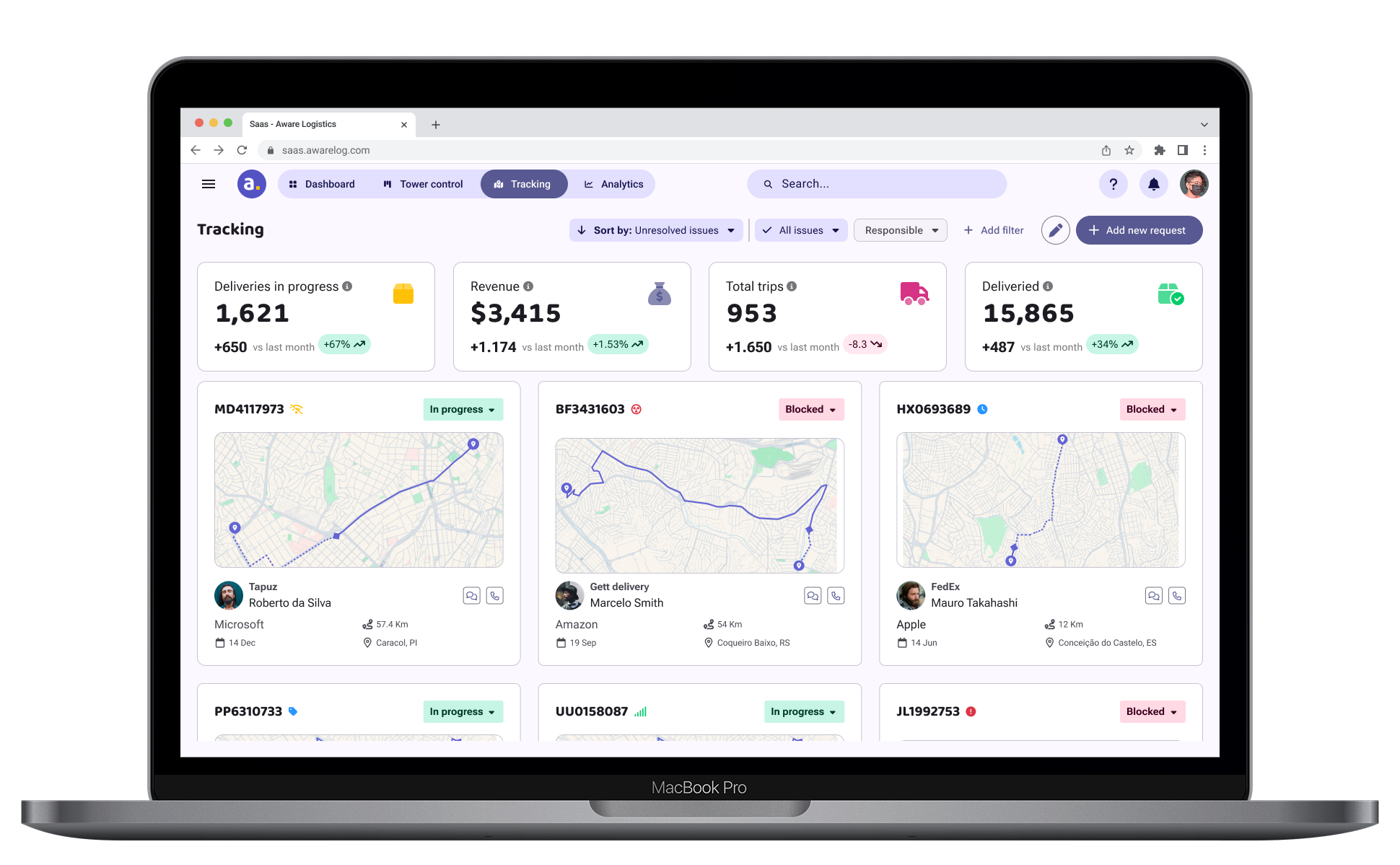
New tracking visualization.
To enhance user control, I added a tracking screen that gives users a clear view of their deliveries in progress.
Tracking screen wireframe
Image
map-location-dot
Instant location updtaes for proactive issue resolution.
Provides a clear audit trail for deliveries.
Offers real-time tracking updates for more multiple deliveries.
Final design
The final delivery
New dashboard home screen.
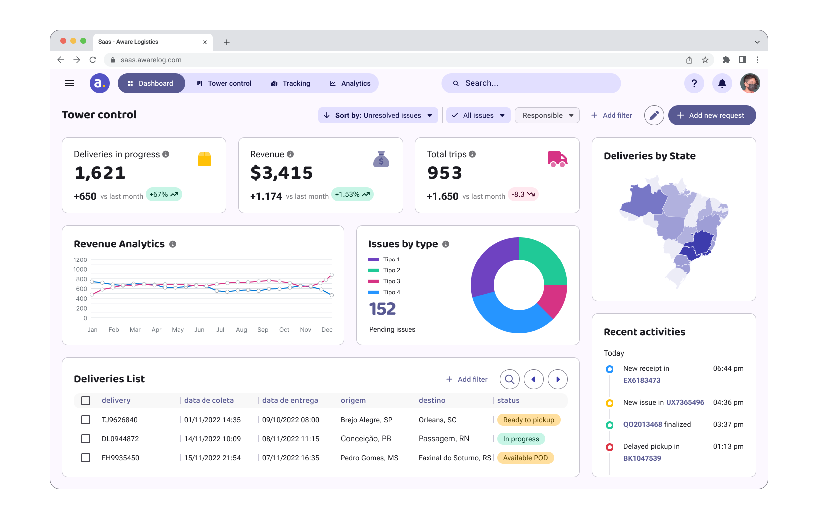
Dashboard final design
Image
Customizing dashboard.
Editing dashboard
video loop
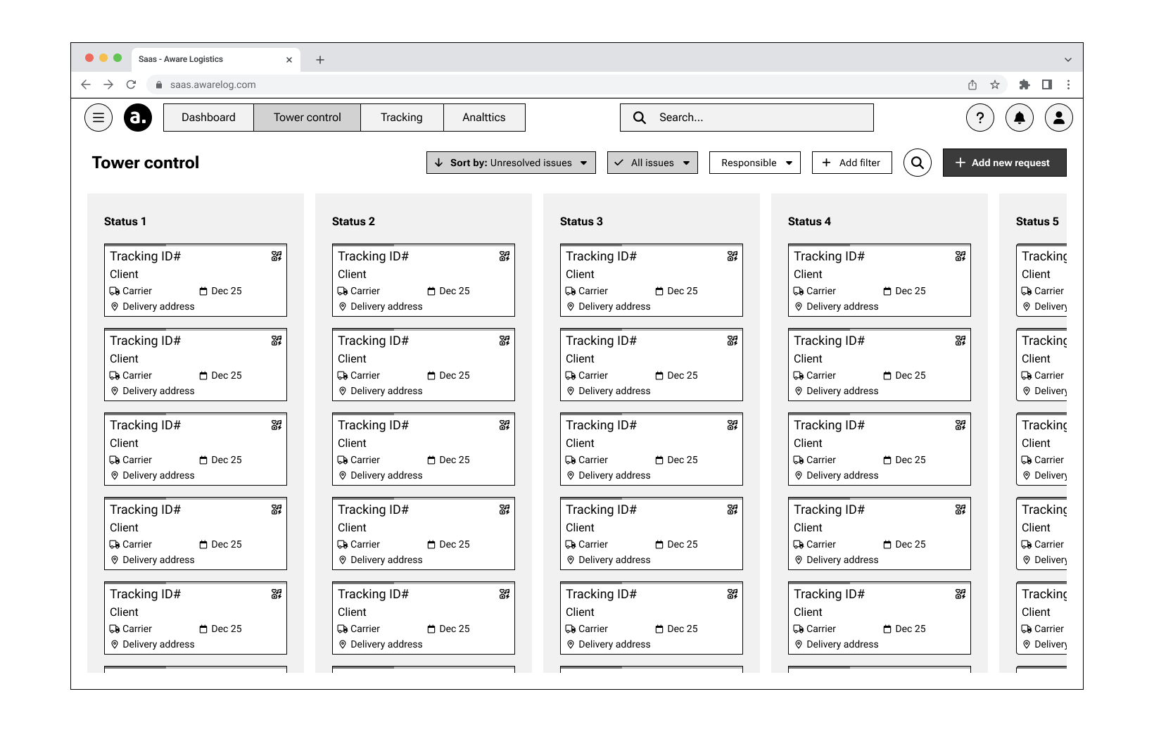
New kanban board.
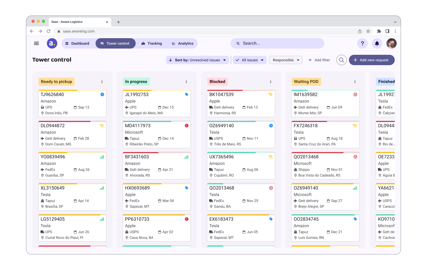
Kanban board
image
Nagivation between deliveries.
Navigation between deliveries on sidescreen
video loop
New tracking viusalization.
Tracking screen
image
restrospective
A very good outcome.
Users feedbacks and numbers.
After implementing the improvements, we conducted user interviews to assess satisfaction with the new changes. The feedback was extremely positive and encouraging.


NPS survey and user interview feedback collection
Image
Personal takeaways:
Mid-fidelity prototype is awesome!
I became much more comfortable prioritizing user flow over pixel-perfect designs in mid-fidelity prototypes. It's a great tool to prevent users from getting distracted by small details during testing.
The earlier we test, the better.
Early feedback trough the mid-fidelity prototype saved time and resources by preventing rework and enabling faster development.
Data-heavy systems are challenging!
I significantly expanded my data wrangling skills, gaining valuable experience handling large, complex datasets. I realized that effective information architecture is key to managing data-heavy systems.
Thank you! Your submission has been received!
Oops! Something went wrong while submitting the form.